We’re the people for:
About us
Welcome to Studio Mosaic. We’re a design and tech agency where good humans go to craft brands, engineer products, and deliver on the trends that move generations.
We’ve earned the trust of America’s leaders and esteemed institutions. Visionary organizations and emerging startups come to us to find their voice and deliver tangible growth. And renowned brands trust our cutting edge work to stay on the pulse of progress.
As a Women-Owned and Black-Owned business, we serve as a leading voice for equitable and inclusive technology and design. Let’s build something special.
Biden-Harris 2024
Studio Mosaic had the privilege of contributing to the launch of Biden-Harris ’24, providing creative direction and technical leadership.
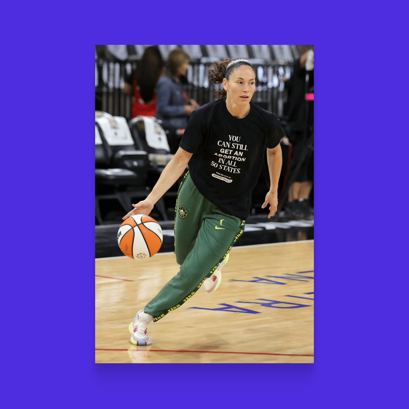
Mayday.Health
Mayday Health is a nonprofit organization that aimed to deliver information about abortion access to all 50 states.
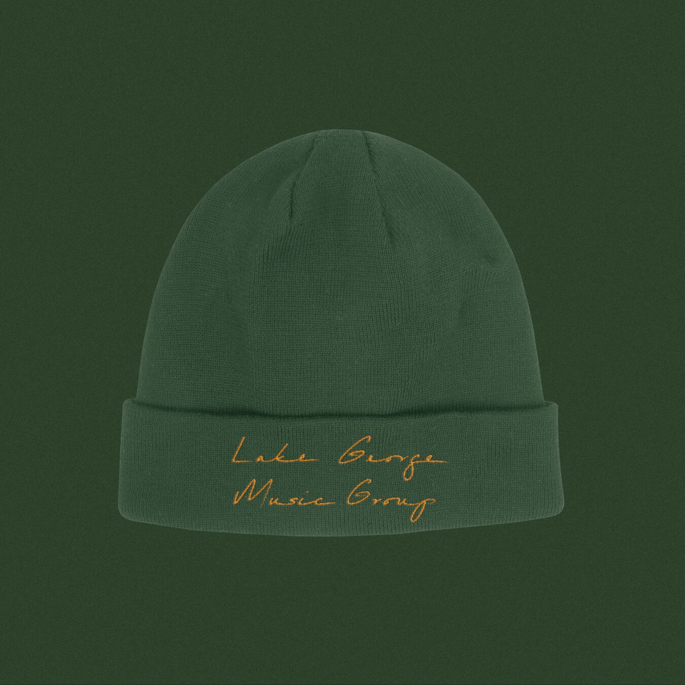
Lake George Music Group
(Nicholas Britell)We branded a music label for Nicholas Britell to release his scores for films such as Moonlight and The Big Short and all four seasons of HBO’s Succession.
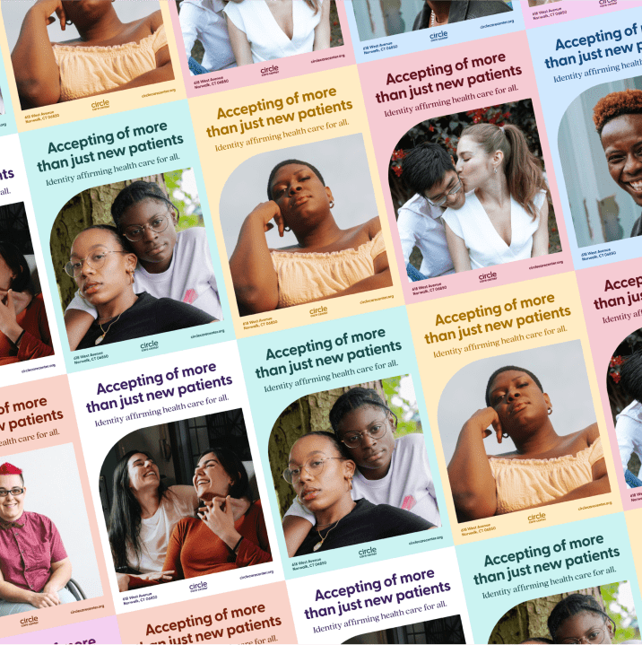
Circle Care Center
Circle Care Center is a Connecticut-based organization that offers LGBTQI+ affirming medical services and sexual health. When they tapped us for a rebrand, we knew we needed to help set them apart from their competition while validating the critical services they offer.

Working with Mosaic felt like a dream from start to finish. I've never worked with a group that consistently produces high-quality professional products while maintaining a familiar, compassionate, and comfortable demeanor until I met their team.
– Anthony Crisci, CEO
Circle Care Center
From I-95's reopening to the Governor's first budget address, Studio Mosaic’s branding has more than leveled up the Governor's messaging and presence.
– Annie Newman, Digital Director
Shapiro for Pennsylvania
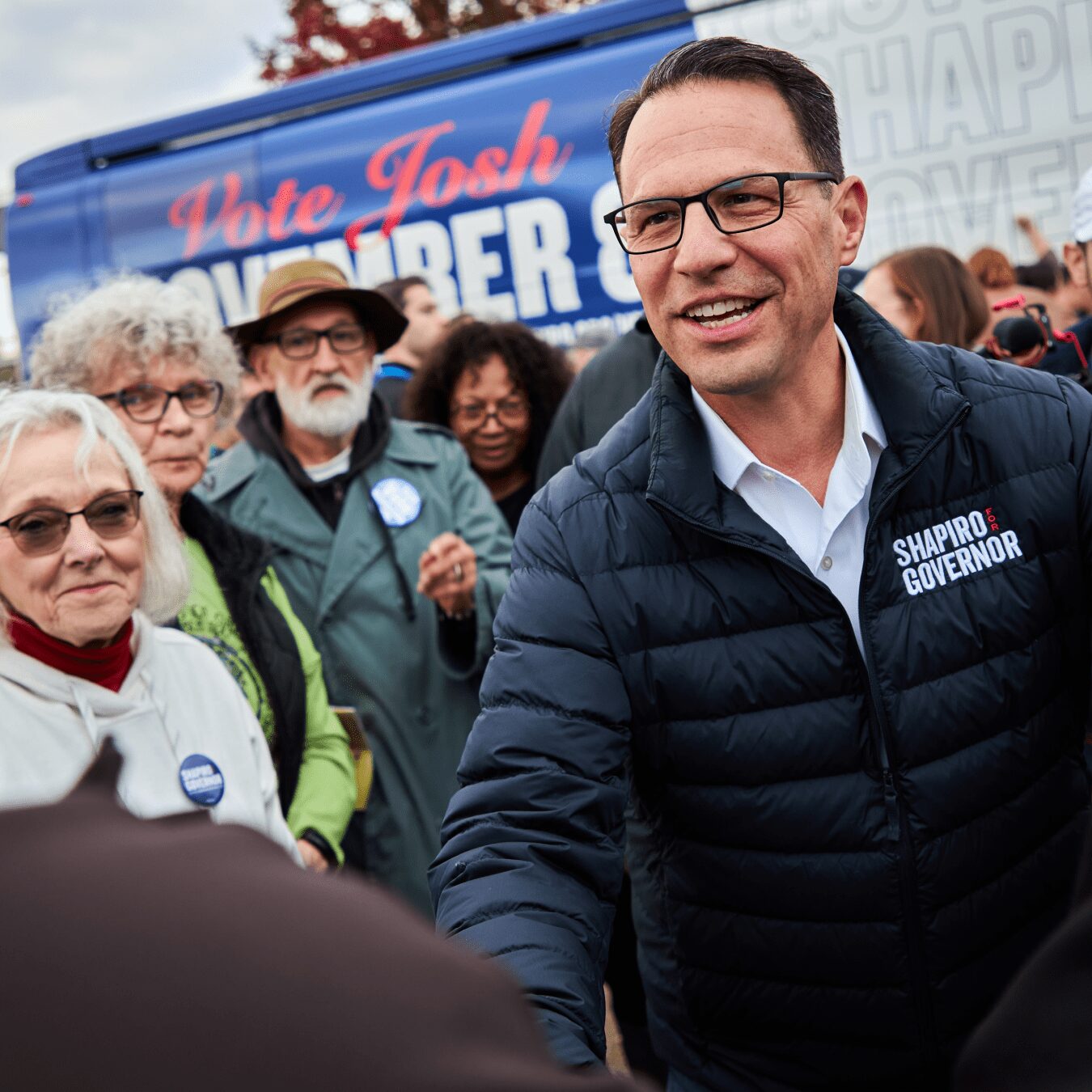
Shapiro for Governor
Our first meeting with Josh Shapiro looked a little different than other brand conversations we've had with politicians—because we didn’t chat politics; we talked basketball.
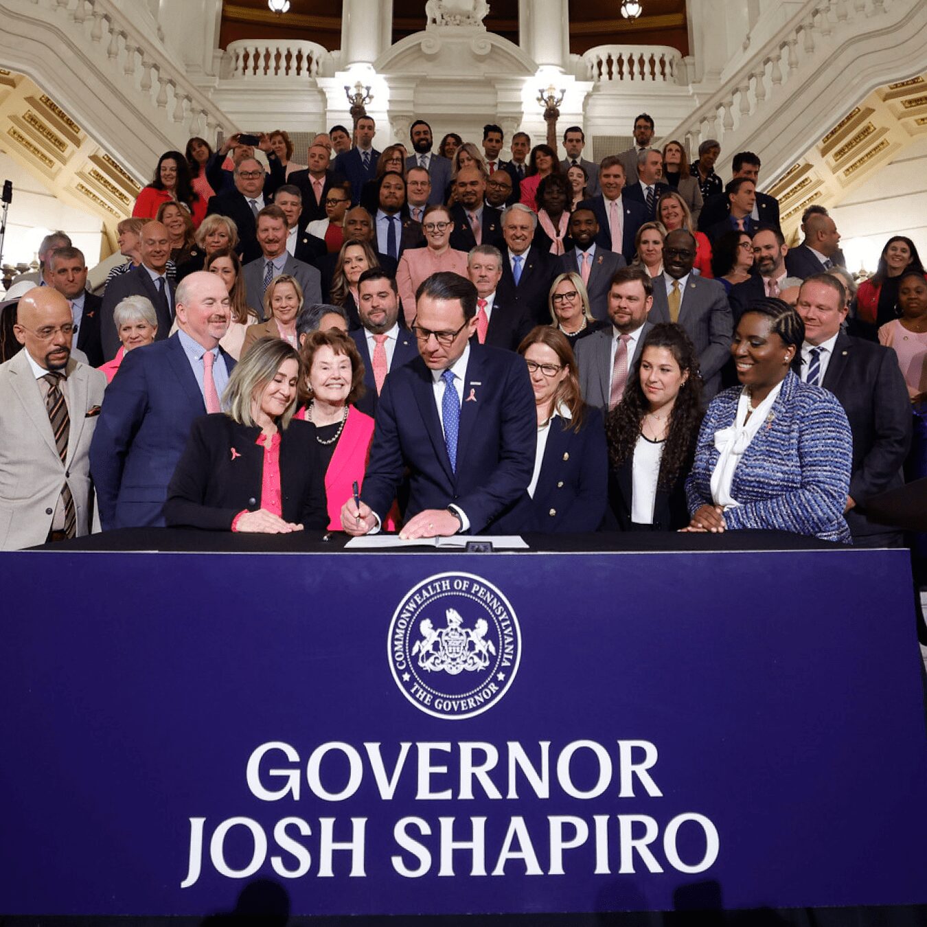
Governor Josh Shapiro
The branding for Governor Shapiro supports their accomplishments with concise messaging, elevated typography, and an inviting and approachable color palette.
Democratic National Committee
The DNC’s first major brand refresh since President Obama took office over a decade ago comes with expressive typography, lively colors, and a fresh new energy. We Are Democrats, and that’s something to be proud of.

With Mosaic, we have a dedicated teammate who delivers in both sprints and marathons. Their blend of urgency and long-term strategy keeps us consistently ahead in a competitive industry.
– Gregory Lettieri, Co-Founder & CEO
Recycle Track Systems

Super Pumped
We were thrilled to get the call to collaborate with Showtime’s internal team to creative direct the logo for their new anthology series, Super Pumped.
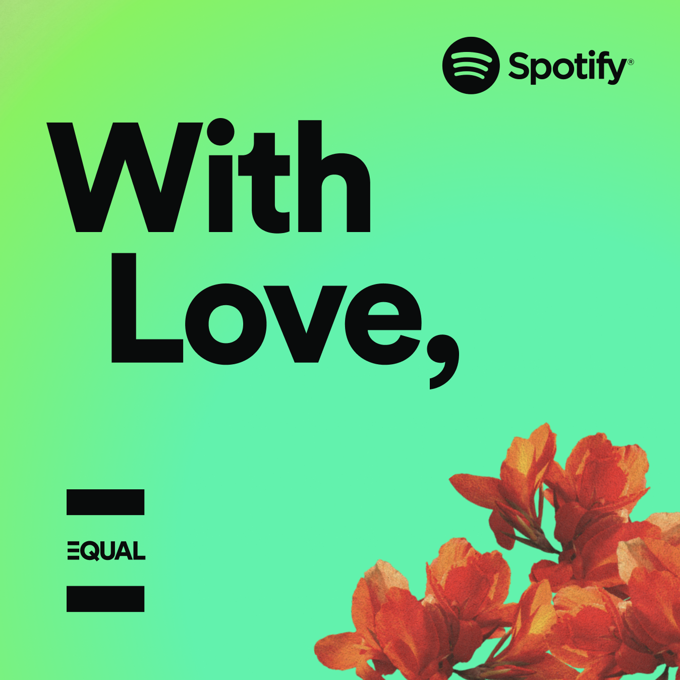
Spotify
“With Love,” elevates the stories of women who are change-makers, storytellers, and artists.
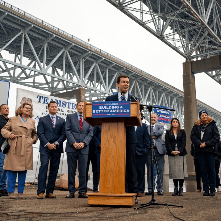
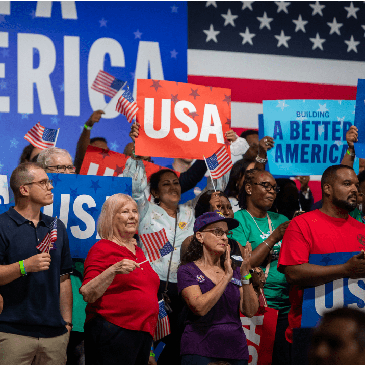
Building A Better America
The Biden Administration asked us to design a brand supporting the Bipartisan Infrastructure Law, which focuses on rebuilding our country’s infrastructure.

Mosaic's critical insights and unique technical skills helped us navigate the tumult, get our message across, and build the necessary support to champion our concept. We could not have built our historic social media campaign without their help.
- Barbara Ortiz Howard, Co-Founder
Women on 20s
